With a very representative appearance that is laid out in a classicist-frontal manner, every form of expansion can quickly be perceived as an insensitive intrusion or as too reserved.
Atelier KempeThill’s design thus originated with the idea that the new building would be positioned visibly and offensively with respect to the old building as befits a representative the new parliament building of the German Speaking Community in Eupen, Belgium.
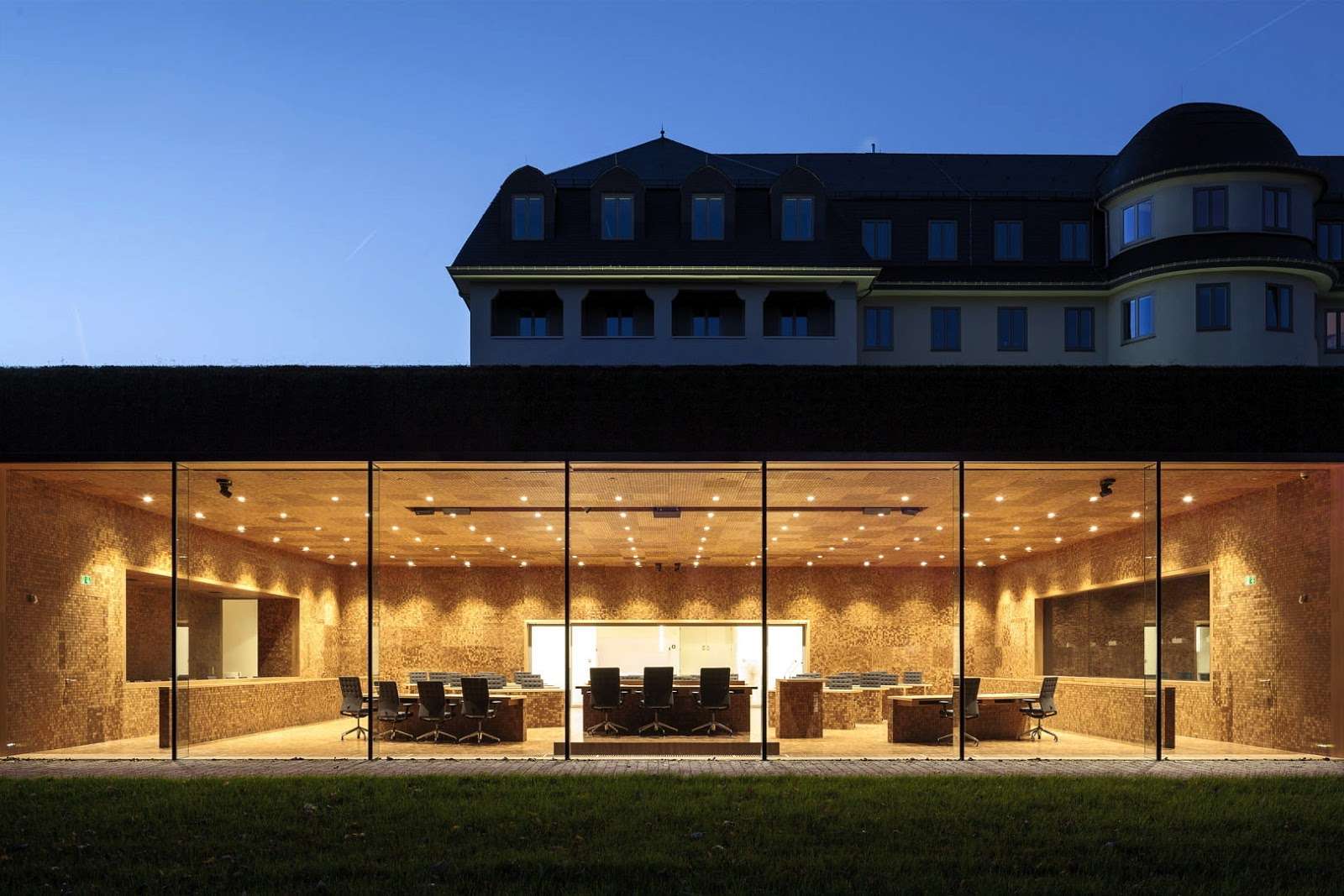
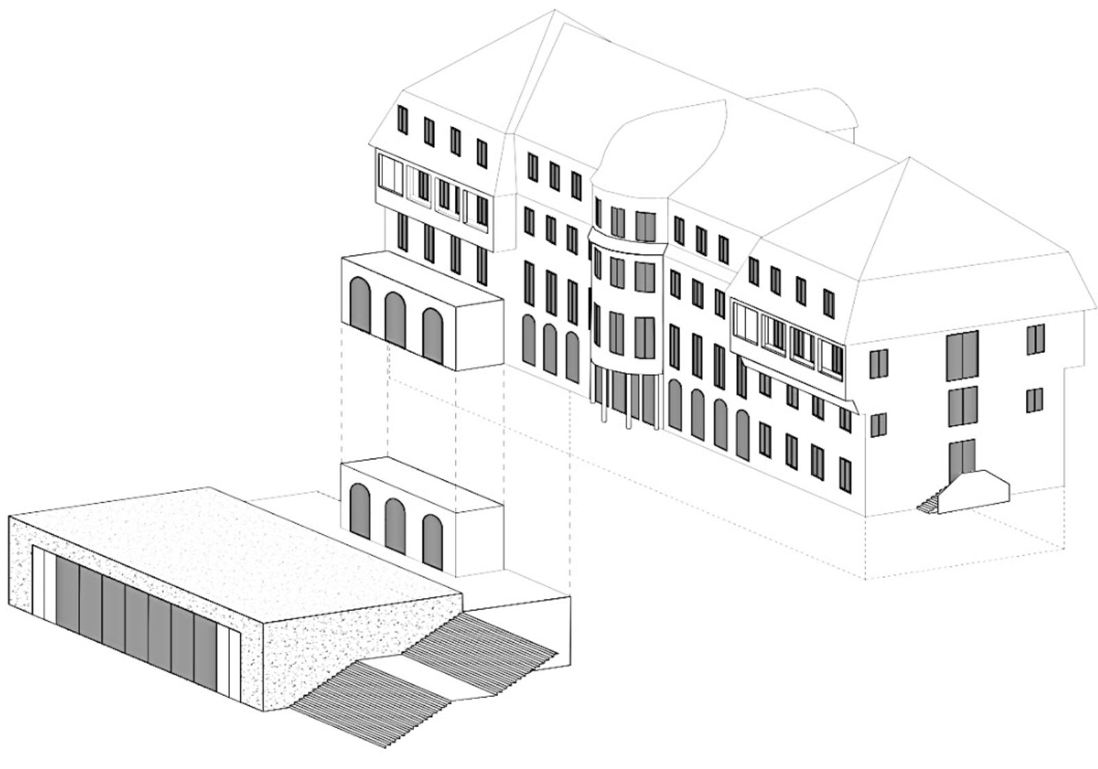
As a result of the nature of the hill on which the “sanatorium” stands, it was possible to position the new building directly in front of it through a simple reshaping of the terrain. Seen from the outside, the already existing building is not simply combined with a new building but instead enters into coherent synthesis with it.
The new building forms an optical plinth for the “sanatorium,” which emphasizes its solitary appearance architecturally and symbolically. The roof and the exterior walls are completely covered with sedum plants. This results in the creation of the impression of a large “flower pillow” in front of the entrance to the entire complex, which generates an inviting atmosphere.
This “landscape object” counters the naturally appearing nature of the park with the seemingly staged nature of an overgrown minimalist object. The new building is thus both a part of the landscape as well as a contrast to it. In the variant to be realized, the new building had to be reduced in size due to budget constraints.
In its extension, a broad flight of steps is situated directly across from the main entrance to the old building. As a result, the landscape character of the new building is somewhat decreased and what is created instead is an object. The flight of steps takes up the axial symmetry of the sanatorium to a certain extent and thus links it architecturally with the landscape and the new building.
Adaptations also have to be found for the detailing of the roof as a whole, since as a result of the necessary thermal insulation, the position of the dormer windows is slightly shifted and their proportions change. Slate is used for the roofing in order to reflect the original roofing.
Beyond considerations of the materials used and the individual details, a larger conceptual problem is encountered: one of the requirements is very high energy efficiency in order to achieve low-energy standards, which, according to the most modern requirements, far exceed the original construction of the building and are supposed to be carefully integrated into the overall concept.
At least just as crucial for the perception of the new building is the spatial scenario of all reception and foyer areas of both the old and the new structures. The foyer is defined by a rigorously symmetrical spatial composition, which links the axial symmetry of the plenary hall and of the staircase with each other by means of large openings in the wall.
The foyer space thus provides a suitable and flexible framework for representative receptions, exhibitions, and the like. The large wall openings from the foyer to the hall are glazed and form a large picture window that allows a view from the foyer through the hall and into the park. This lends the space a bright and airy character, which is emphasized even more by a generous, central skylight and the multifaceted visual relationships that are created.
Location: Eupen, Belgium
Architect: Atelier Kempe Thill
Partners: Artau architectures
Project Team Atelier Kempe Thill: André Kempe, Oliver Thill, Saskia Hermanek, Ruud Smeelen, Daniela Bergmann, Laura Paschke, Tobias Windhus, Helen Webster, David van Eck, Andrius Raguotis, Martin Hättasch, Wojciech, Jakub Narloch, Giorgio Terraneo, Roel van der Zeeuw
Project Team Artau: Alice Scheen, Gaëtan Lejoly, Katrin Ossemann, François Laurent, Roland Coulon
Year: 2013
Client: Parliament of the German-speaking community
Photo: Ulrich Schwarz


