But first: This is how we like to do it, how the architecture tourist beach bunny marine command gets the job done at Ormond by the Sea. The pelicans perform a fly-by.

Last weekend we visited Debbie and Dave in their mid-century modern home 1300 feet from the beach. We'd been several times before but this time we played Architecture Tourists.
I confess that I'm tired of the words "mid-century modern." The pictures in magazines and on the web are all about the extreme show houses of the time. And the furniture, well, you know what I mean.
But there are a ton of ordinary, good-living modern houses and we had 3 nights to enjoy one of them. And enjoy it we did. It's a remarkably pleasant house.
Here she is, 2 bedrooms, 2 baths, single garage (with workshop and laundry), huge screened lanai and screened pool, about 1300 square feet. It sits on a street with similar ranchers, some with 2 car garages and 3 bedrooms. Built in 1964, perhaps from a pattern book.
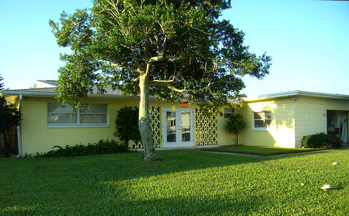
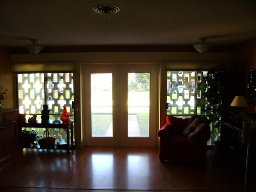
Here is the entrance. Notice the overhangs and big windows. Does anyone know what to call those concrete trellis things on either side of the doors? (The perforated concrete wall is called a brise soleil, French for sun breaker - thanks to Spencer Howard) The street has a great variety of those things. Whatever they are called, there are 17 feet of floor to ceiling windows behind them opening to the big room. The back side of the big room also has 17 feet of floor to ceiling windows that can open completely to the lanai. And that is a nice room.
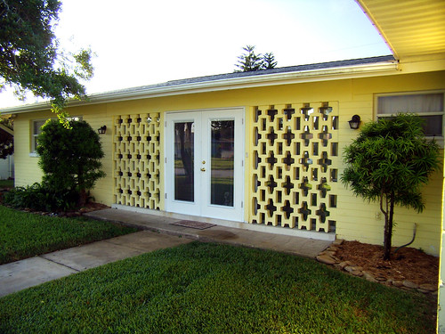
Deb and Dave replaced the solid front doors with these all glass doors. Obviously it was designed to have glass doors.
Can imagine this view with solid doors? It wasn't nearly as good. My eye avoided looking over there. Now, the trellis thingys frame the view through the doors. It's a Zen view (134. ZEN VIEW). Even at night with outdoor lights this view works to extend the big room. Tara would be proud of the vanishing threshold and that's not the only one in the house.
Here is my hand drawn floor plan. Note the floor to ceiling windows. Each is a vanishing threshold. They make the house feel huge. It's like the huge lanai is part of the master, the big room, and the kitchen.
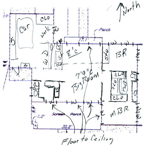
For you Pattern Language Fans: 159. LIGHT ON TWO SIDES OF EVERY ROOM. Enough said except: Notice the bath between the bedrooms? It has just one window over the toilet. Yet, it is a most pleasant space. Following the pattern, it works because it is a wide window, with a deep reveal in a very shallow room. Nice, nice, nice.
Before I quit two words:
Terrazzo Floors. I think the entire house has Terrazzo floors now done in wood. But the terrazzo is still there in the bathrooms. Until this house, I didn't realize that I love Terrazzo floors. Nice, nice, nice.
Wait, there is a puzzle: My house has more and bigger windows but Deb & Dave's is brighter inside. How come? Well, Atlanta has big, tall trees. At our place they smother the house in the summertime. On Deb and Dave's barrier island there aren't any tall trees, at all. It makes a big difference. When the leaves are gone and the sun is lower, our house brightens right up.
Thanks,
Terry
